 The role of an album cover is ultimately to appeal to a customer as well as show a little about the artist who has recorded the album. Through history album covers have changed in style and design due to the increase in technology and software.
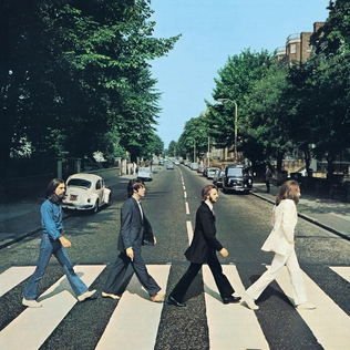
  For example The Beatles album cover of Abbey road is probably the most iconic of all time. The infamous photo of the band walking over the zebra crossing is instantly recognizable. This has helped the album achieve legendary status. When you observe a wide range of album covers, they do not necessarily have any direct connotations to the music on the album, although the name of 'Abbey Road' has a direct relationship with the content of the album cover. This technique of using photography on an album cover obviously looks very natural and is far more simple than doing a high-tech approach. I also looked at The Verve album, 'Forth' which is a photograph of clouds in a low saturation, which I can only guess is due to one of the track listings on the back, "Valium Skies", which is not actually the single. This photography of these clouds in orange and brown tones is continued across the four panels and is actually quite unique in comparison to the current market.
 The Verve album represents the 21st century and The Beatles represents the 20th. It does show now how much (as mentioned) that technology has progressed and the simple things are often ignored. Even though the Verve album cover has been edited in terms of the saturation, it still is a lot less advanced than many of the album covers around in the current market.


When looking at editing photographs, there is a live Foo Fighters album named 'Skin and Bones' where a crowd is pictured on the front - as the album is of a live concert they performed which is obviously a direct relationship to the content of the album. The back of the album is a selection of shots from the concert in question along with the track listings. The band name is written in black across the lightest section of the artwork - where the image has been flared to allow it to be easily visible and dominant. As a group we looked at this idea using natural objects to potentially create our album cover so we had a look at photos we had to see if it could hypothetically work as one. For example this picture of a solitary rock in the water may perhaps provide a natural look but at the same time our song is called YOUNG BLOOD, so there has to be some relationship to either the music video or the song itself, so looking at this idea seems rather pointless and unadventurous.


From a literal translation of the album name to the image, there is also a more simplistic route where the background of the cover is plain with the artists name and album name printed in the centre - as seen by Nirvana on their 'You Know You're Right' album. This shows a variety of what can be noted on several album covers in the industry. So it doesn't have to be very technical and dazzling even in the current market, where a simple album cover can still do the job. It is kind of a 'does what it says on the tin' job, but still effective none the less. I can also relate this to the 'Plain White Ts' album, 'Natural Disaster'. They use the font differently to Nirvana, and make it large capitals in a way where it looks like it is drawn on with chalk. Yes, it can be said as lazy or too simplistic, but the font allows it to catch the eye of the customer due to the size of it, even though the background is a simple grey one. If I personally was designing the album cover for the Plain White Ts I would literally translate 'natural disaster' into art and create a very dramatic earthquake seen for example. But they have achieved catching the eye of any potential customers differently by using font size and style to their advantage. The sole grey colour is bold and draws your attention to it.
 |


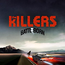
When looking through the albums I have at home I also found 'Keane, Under The Iron Sea' which shows cartoon-like horses diving into the sea in aqua colours (relating to the sea). In this case, the software is used to create the horses in an unrealistic sense but it also has a comic book look to it. When you compare this to the album artwork of the Killers, there shows a complete contrast in how the software is used, suggesting there are no limitations with the software that is available now. I feel personally that we should utilize what is in front of us and come up with something new and exciting - but also in keeping with products in the current market.
 Something that I would say crops up most is the presence of members of the band or artist on the actual album cover. This shows a DIRECT RELATIONSHIP between the makers of the album and the album itself - besides of the name on the front. It gives it a more personal touch and also can show off the band's personality by showing their clothing and their poses e.g.) arrogance etc. See my video to explain about this theme <<.
 As a group we discussed this idea and thought about getting the band in shot in front of the car (which belongs to Dom). We thought this would look quite cool and also shows that we have recognised the trends shown by other bands where they picture themselves on the album cover seen in Oasis' 'Definitely Maybe' and Arctic Monkeys 'Humbug' album artwork.
I then looked more directly at some albums I had over ALL 4 PANELS....
Bombay Bicycle Club - Flaws:
Bombay Bicycle Club's album cover for "Flaws' is a oil painting which explores musky and dark tones. The album itself is representative of the band going back to basics in their music and toning down their electrical riffs to acoustic chords.
The music is in the folk genre in this album and therefore this style and simplistic nature is carried across into the design of the digipak. The font is one of a classic nature in white. This classic approach is corresponded in videos such as 'Dust on the Ground' which is featured on the album also. It shows the band in an old fashioned manor house surrounded by women dressed in corsets...a literal translation of classic and archaic. The band themselves are quite unique from the rest of the music industry and this album distances them even further from other bands in terms of their individuality.
Demon Days - Gorillaz:
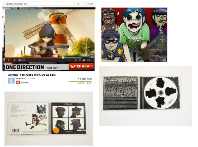
Gorillaz are actually a visual and musical project created by Damon Albarn in 1998. They are depicted in a virtual and fictional universe. This made up world is shown through their music videos as shown to the left in the music video of 'Feel Good Inc'.
The cartoon band members are pictured in a grid of profile shots on the album cover for Demon Days with a 'Parental Advisory' sticker underneath to suggest this is material for more mature audiences. This is then repeated on the actual album in silhouetted form in black and white which shows continuation from the front. The band name is written small at the top and then even smaller at the bottom - the name of the album (again in white). The album achieves a house style of black and white through to the back. Where the tracks are listed the lead singer's cartoon is pictured next to the text, showing again that this band is fictional. The consistancy of white and black is seen throughout which I personally feel allows the bright and vibrant colours of the cartoons to stand out in their own right.

Tom Vek - Leisure Seizure:
This album artwork is very similar to Gorillaz in the sense that there is a continuation of colours. In this case they are red, white and black = simplistic. There is an image of Tom Vek's notorious glasses on the front of the album which gives it an identity as well as reflecting the artist. The name of the album 'Leisure Seizure' is shown in large bold capital letters on the inside cover and the back with the tracklistings.
The words 'Tom Vek' are cleverly entwined on the front with a red line highlighting the name VEK. This is also shown on the back and inside. The CD has a random cartoon on it which looks like a ghost (I am not entirely sure what it is meant to be), but it keeps in with the simplistic nature of the house style. In the video of 'Aroused' by Tom Vek, it is shot completely in black and white showing the relationship between the single's promotional video and then the album cover/artwork.
Matt came up with the idea of using a steel wool effect which combines the idea of using natural lighting with technology. We could put it into Photoshop and make it into an orb type shape around a person which is not only unique but exciting. This is where you film (with several seconds ex poser) a person spinning lit steel wool which can be easily constructed.
Obviously we would have to assess the risks beforehand but if it looks safe then we can experiment with it. Danny found a tutorial of the steel wheel technique on Youtube to show us how to do it - Matt had initially seen this on a tv programme I think. I personally feel we can relate the idea back to the blurred lighting in the Bloc Party album I found in my research.

No comments:
Post a Comment